Pattern
Targets under 24 px
Controls measure under the minimum target size, so someone with limited dexterity, or anyone on a touch screen, can miss them.
9 findings at 8 companies in 4 sectors, filed under 2 heuristics
Apple, Chase, Costco, Microsoft, RBC Royal Bank, TD, UnitedHealthcare and Walmart
Where I found it
Apple Medium
Footer legal links on the French pages are 16 px tall and touching
At 390 px the footer legal links on the French home page and the French iPhone 18 Pro page are 16 px tall, under the 24 px of WCAG 2.2 criterion 2.5.8 (AA), with rows 21 px apart. ‘Politique de confidentialité’ ends where ‘Utilisation de témoins’ begins. Get Support and iPhone support fail the same way at 16 px, and System Status at 15 px.
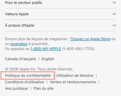
Phone, 390 px wide, taken 30 October 2026. The frame marks what the finding is about. Chase Medium
The sign-in box's Show password button is 21 px tall
The 'Show' button in the password field, named 'Show Password' and with no aria-pressed, is 52.3 by 21.2 px on the home page at 1440 px and on the sign-in page at 1440, 820 and 390 px. That's under the 24 by 24 px minimum with another target within 12 px of its centre, and axe target-size (WCAG 2.2 success criterion 2.5.8, level AA) fails on it on both.
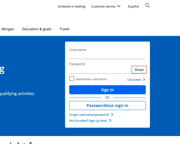
Desktop, 1440 px wide, taken 30 October 2026. The frame marks what the finding is about. Chase Medium
The 'Account details' links on Checking accounts are 19 px tall on a phone
At 390 px the 'Account details' link under each account is 99.3 by 19 px, and axe target-size (WCAG 2.2 success criterion 2.5.8, level AA) fails on 6 elements on the page, among them footer links such as 'Online Banking' at 18 px. On the account offer page at account.chase.com, 'View Monthly Service Fee Section' is 15 px tall at 390 px and fails the same rule.
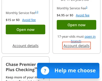
Phone, 390 px wide, taken 30 October 2026. The frame marks what the finding is about. Costco Medium
Product-card delivery links and footer links are under the 24 px target size
Ten ‘2-Day Delivery’ links in home page product cards are 20.8 px tall, and 55 of 61 footer links are 23.8 px tall with no gap: under the 24 px of WCAG 2.2 criterion 2.5.8 (AA). The 8 px buttons beside the navigation labels are keyboard duplicates: hovering a label opens the same menu, and on focus the button grows to 32 px, so the exception for an equivalent covers them.
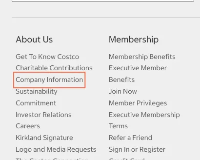
Tablet, 820 px wide, taken 25 October 2026. The frame marks what the finding is about. Microsoft Medium
Colour swatches on Surface accessories measure 12 × 12 px on tablets and phones
The Surface accessories cards offer colour as buttons ('Gray', 'Violet', 'Ocean') of 12 × 12 px, 20 px apart. axe reports target-size on all 6 at 820 and 390 px. The sign-in page's 'Privacy and cookies' link, 20 px tall, fails the same rule at all 3 sizes.
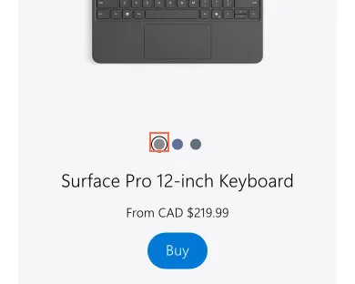
Phone, 390 px wide, taken 30 October 2026. The frame marks what the finding is about. RBC Royal Bank Medium
Footnote links on Compare Chequing Accounts are 4.3 px wide and named 'legal bug'
The footnote links in the comparison table measure as little as 4.3 × 9 px and are named 'legal bug 1', 'legal bug 40' and 'legal bug †'. axe reports target-size at 1440 px on the 4 that have no 24 px of clear space around them. On a phone 4 of the home page's 5 hero slide dots are 8 × 8 px, 8 px apart.
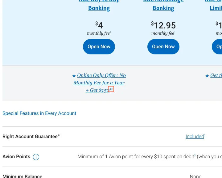
Desktop, 1440 px wide, taken 30 October 2026. The frame marks what the finding is about. TD Medium
Footnote links '2' and '3' in the mortgage rate table are 10 px tall
In the rate table on Today's Mortgage Rates, footnote links '2' and '3' measure 5.8 × 10 px and 6.2 × 10 px at 1440 px, with their centres 2.9 px from 'Special Rate' and 3.1 px from 'APR'. axe reports target-size for them at all three sizes, and for the same table on the Mortgages page.
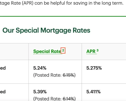
Tablet, 820 px wide, taken 30 October 2026. The frame marks what the finding is about. UnitedHealthcare Medium
On Shop for a plan the header’s ‘Español’ link is 20 px tall, with a target within 12 px
At 1440 px the header link ‘Español’, the way to the Spanish-language site, is 50.4 × 20 px on Shop for a plan, under the 24 × 24 px minimum, with another target within 12 px of its centre. The capture of 25 October found the same on Home. On Medicare the same link is 24 px tall.
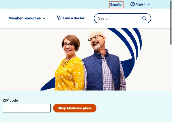
Desktop, 1440 px wide, taken 26 October 2026. The frame marks what the finding is about. Walmart Medium
Footer links are 21px tall and tightly stacked, in one ungrouped run
The footer is 24 links in three rows with no headings, from ‘All Departments’ to ‘Delete Account’, with ‘Help’ and ‘Accessibility’ among them. Each link is a 21px-high box and the rows sit 21px apart. axe flags the links for target size (WCAG 2.2 success criterion 2.5.8, level AA), and the run is hard to scan and to tap.
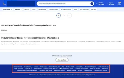
Desktop, 1440 px wide, taken 19 October 2026. The frame marks what the finding is about.
What I’d change
Pad each target to at least 24 px in each direction, and the visible text or dot can stay the size it is. Where padding won’t fit, leave clear space between the target and its neighbours.