UX heuristic analysis · Technology
Microsoft.com: a UX heuristic analysis
For Microsoft’s digital product team
- Assessed
- Published
- Examined
- 36 pages of Microsoft at desktop (1440 px), tablet (820 px) and phone (390 px)
- Method
- 36 public pages, read signed out at three sizes (1440 × 900, 820 × 1180, 390 × 844) in headless Chromium on 30 October 2026; measured with axe-core and the engine's own checks, every finding checked by hand. robots.txt disallows the cart and search results, so I examined neither. The sign-in page is Microsoft's login.live.com, reached from the Sign in link after account.microsoft.com refused the connection; Support, Contact and Accessibility are the en-US or global pages the en-CA site links to. I reviewed the pages from Toronto, Canada.
Summary
Microsoft's store pages open a sign-up dialog on load, and a Surface help link has the wrong name
Microsoft's 'Sign me up' dialog opened about 3 seconds after load on 5 of the 10 pages I tried, and at 390 px the cookie banner covers its Close button. On Surface help and support the 'Contact support' link is named 'View all topics', and axe found visible words missing from control names on 26 of 36 pages. Colour swatches on Surface accessories measure 12 × 12 px on phones, and the deals page's original prices measure 3.11:1. axe found 7 rules failing at 3 sizes. I read the pages from Toronto, Canada, and robots.txt kept me out of the cart and search results.
Where to start
- Finding 8: The Surface help page's 'Contact support' link is named 'View all topics' Medium
- Finding 5: A sign-up dialog opens on load, and at 390 px the cookie banner covers its Close button Medium
- Finding 1: Controls on 26 of 36 pages omit visible words, 'Shop now' and 'Buy' the purchase ones Medium
- Finding 7: Colour swatches on Surface accessories measure 12 × 12 px on tablets and phones Medium
- Finding 10: Original prices on the Microsoft Store deals page measure 3.11:1 Low
| High | Medium | Low | Best practice |
|---|---|---|---|
| 0 | 6 | 5 | 2 |
The 13 findings
The findings about the whole site come first, then each page in the order I examined it, most severe first within each. The levels (high, medium, low, best practice) are explained on the method page.
Finding 1Medium
Controls on 26 of 36 pages omit visible words, 'Shop now' and 'Buy' the purchase ones
Observation
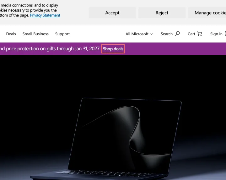
axe reports label-content-name-mismatch on 26 of the 36 pages, 7 elements on the home page at 1440 px, where 'Shop deals' is named 'Shop Microsoft Store Deals now' and the hero's 'Shop now' is named 'Shop Surface Laptop Ultra'. On Surface, 'Buy' is named 'Learn more about Surface accessories on Microsoft Store', and the French page's 'Acheter' does the same. Compare plans adds 27 with its dialog closed.
Implication
A voice-control user who says 'Shop now' or 'Buy' doesn't reach these controls, on the buttons that start a purchase. On Surface, a screen reader user hears 'Learn more' for a link the screen labels 'Buy', so the purchase link doesn't announce itself as one.
Recommendation
Start each name with the visible words, such as 'Shop now: Surface Laptop Ultra', or keep the visible text as the name and add the product with aria-describedby. Fix the shared card and hero components first, because the same pattern runs through the English and French pages.
Measured
- 'Shop deals' is named 'Shop Microsoft Store Deals now'
- axe label-content-name-mismatch: 7 elements (serious)
- axe label-content-name-mismatch: 16 elements (serious)
Finding 2Low
The home page scrolls 32 px sideways at 1440 px
Observation
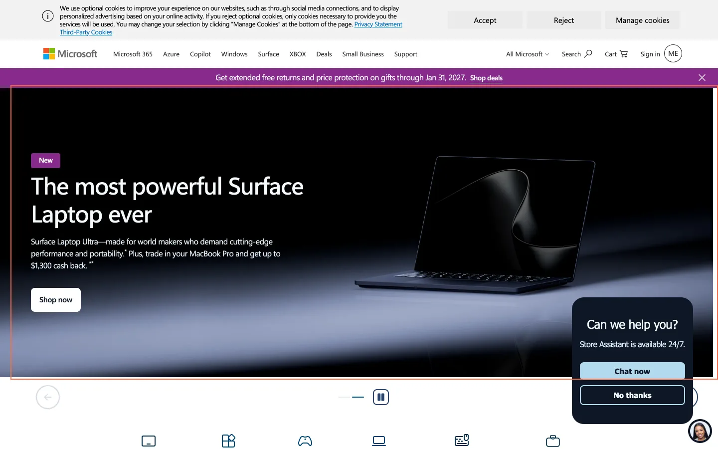
At 1440 px the home page is 1472 px wide in a 1440 px viewport, and it scrolled 32 px sideways on the live check. The engine's measure points at a carousel, and neither html nor body clips it. The French home page has the same width.
Implication
A sideways swipe on a trackpad moves the whole page by 32 px, on the page most visitors see first.
Recommendation
Clip the carousel track at its wrapper with overflow: hidden or overflow: clip, and check the widths around 1440 px.
Measured
- Home scrolls 32 px sideways at 1440 px
- Page 1472 px wide in a 1440 px viewport
Finding 3Best practice
Canadian pages send Support and Accessibility to other countries' sites
Observation
The en-CA header's Support link goes to support.microsoft.com/en-us and the footer's Accessibility link to /en-us/accessibility. The fr-CA home page sends the same 2 links to fr-fr pages, France's French. Other links on the same pages, such as Surface, leave the locale out and arrive at en-CA.
Implication
A Canadian visitor reaches pages written for another country, in its spelling and with its examples.
Recommendation
Link to the en-CA and fr-CA versions, or leave the locale out so the server picks it, as the Surface links do.
Measured
- Support and Accessibility links name en-us and fr-fr
Finding 4Best practice
Main buttons on Microsoft 365 open a new tab with no cue
Observation
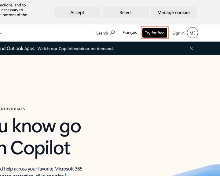
On Microsoft 365, 'Try for free' and 'See plans and pricing for Microsoft 365' open a new tab, with no icon and nothing in their names. The engine reports links like these on 34 of the 36 pages. Microsoft's accessibility page puts 'opens in a new tab' in its link labels.
Implication
A visitor who presses Back after choosing a plan finds it does nothing, because the new tab has no history.
Recommendation
Open plan and trial links in the same tab, or add the wording the accessibility page already uses.
Measured
- 'Try for free' opens a new tab with no cue
- Try for free: opens a new tab, no cue
Finding 5Medium
A sign-up dialog opens on load, and at 390 px the cookie banner covers its Close button
Observation
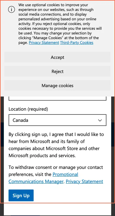
In a fresh profile a 'Sign me up' dialog opened about 3 seconds after load on 5 of the 10 pages I tried, including Compare plans, Surface Laptop Ultra for Business and shop all Surface. At 390 px the 328 px cookie banner covers the dialog's heading, email field and Close button, which is where focus lands. Closing the dialog leaves focus on the body.
Implication
A new visitor reaching a price or a product meets a marketing form first. At 390 px the visible part of the dialog offers Sign Up and shows no way to close it, and the focused control is out of sight. After closing, a keyboard user starts again from the top of the page.
Recommendation
Don't open the dialog while the cookie banner is showing, or replace it with an inline sign-up box on these pages. When it closes, return focus to the element that had it, or to the page's main heading.
Measured
- Cookie banner, 328 px tall, covers the Close button
Finding 6Medium
An empty link on Surface Laptop Ultra takes keyboard focus and has no name
Observation
In the page's footnotes, after 'Activation required', a link has no text and no label. Its href is '#', its target is _blank, it measures 0 × 19 px, and it stays in the Tab order. axe reports link-name at all 3 sizes. Its data-bi-ecn attribute reads 'Try Microsoft 365 for a month - Microsoft Store'.
Implication
A keyboard user lands on nothing visible, and a screen reader announces a link with no name. The footnote about the charge after 30 days doesn't offer the link its attribute describes.
Recommendation
Restore the link's text and its address to the Microsoft 365 trial, or remove the empty anchor from the footnote.
Measured
- Empty footnote link: href '#', tabIndex 0
- axe link-name: 1 element (serious)
Finding 7Medium
Colour swatches on Surface accessories measure 12 × 12 px on tablets and phones
Observation
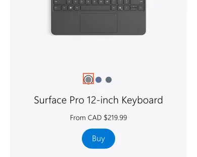
The Surface accessories cards offer colour as buttons ('Gray', 'Violet', 'Ocean') of 12 × 12 px, 20 px apart. axe reports target-size on all 6 at 820 and 390 px. The sign-in page's 'Privacy and cookies' link, 20 px tall, fails the same rule at all 3 sizes.
Implication
A person with limited dexterity on a touch screen can miss a swatch or pick the colour next to it while choosing an accessory to buy.
Recommendation
Give each swatch a tap area of at least 24 × 24 px, keeping the 12 px dot inside it, and add the same height to the sign-in page's footer links.
Measured
- Colour swatches: 12 × 12 px, 20 px apart
- axe target-size: 6 elements (serious)
- axe target-size: 1 element (serious)
Finding 8Medium
The Surface help page's 'Contact support' link is named 'View all topics'
Observation
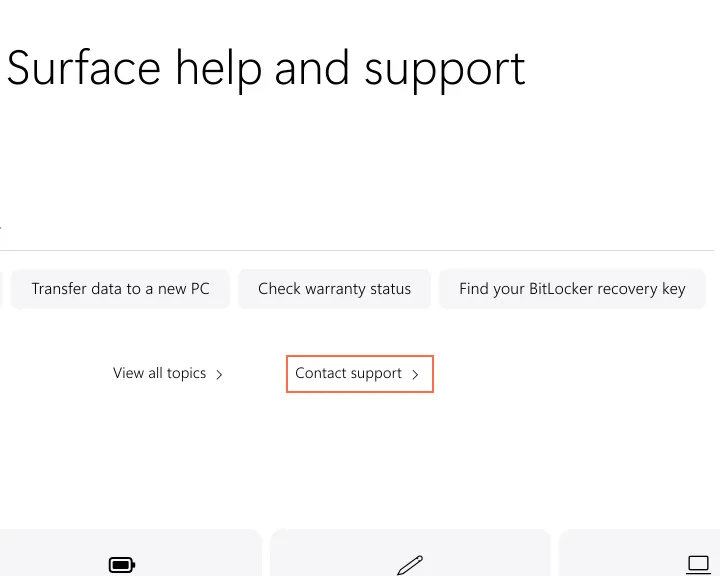
On Surface help and support, the 'Contact support' link goes to support.microsoft.com/contactus and has the aria-label 'View all topics opens the Surface support webpage', copied from the link beside it. The 'Transfer data to a new PC' button has the label 'Set up your Surface populates the Search line.' axe reports label-content-name-mismatch at all 3 sizes.
Implication
A screen reader announces 2 links called 'View all topics' and never says 'Contact support', on the page a Surface owner opens when something's wrong. A voice-control user who says 'Contact support' doesn't reach the link. The transfer button is announced as a different task from the one it runs.
Recommendation
Remove both aria-labels so the visible text is the name, or give each control its own label starting with those words. Then read the other labels in the same list, because both errors repeat the neighbouring entry.
Measured
- 'Contact support' is named 'View all topics…'
- axe label-content-name-mismatch: 3 elements (serious)
Finding 9Low
A footnote link on Surface help has no mark that it's a link
Observation
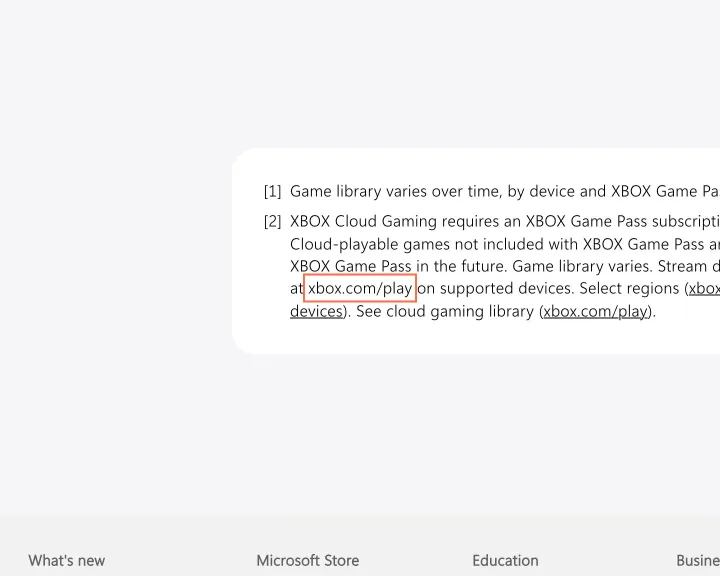
In the XBOX Cloud Gaming footnote on Surface help and support, one 'xbox.com/play' link is rgb(0, 0, 0) with no underline, the same colour and weight as its sentence. A second copy of the link is underlined.
Implication
A reader who doesn't hover over the address can't tell it's a link, in a footnote that says what the service needs.
Recommendation
Underline the link, as the second copy is.
Measured
- Footnote link: same colour as its sentence, no underline
- Links not set apart from text: 1, contrast 1.0:1
Finding 10Low
Original prices on the Microsoft Store deals page measure 3.11:1
Observation
On Deals, the original prices on 2 cards, CAD $2,599.99 and CAD $2,609.99, are 12 px #889399 on #FEFEFE, which measures 3.11:1. axe reports color-contrast on both at all 3 sizes.
Implication
The original price is the figure each saving on a deals page is measured from, and at this contrast it's hard to read for a person with low vision.
Recommendation
Darken the original price to at least 4.5:1, such as #6B747A (4.73:1), in the shared price component.
Measured
- Original price: 3.11:1 at 12 px
- axe color-contrast: 2 elements (serious)
Finding 11Low
The Store Assistant invitation covers the product on a phone
Observation
On Surface Laptop Ultra for Business at 390 px, a 'Can we help you?' card with 'Chat now' and 'No thanks' opens within 9 seconds of load, over the product picture and below the open cookie banner. The same card, 243 × 254 px, covers a product on the home page at 1024 px.
Implication
On a first visit the banner and this card fill most of the screen, so the visitor has 2 boxes to clear before seeing the laptop, after the sign-up dialog on pages that open it.
Recommendation
Keep the round chat button the pages already show, and open the card only when a visitor asks for it.
Measured
- 'Can we help you?' card open within 9 s at 390 px
- Overlap: 243.2 × 208 px (50592.8 px²)
Finding 12Medium
Hidden Game Pass plan cards keep a focusable link at 820 and 390 px
Observation
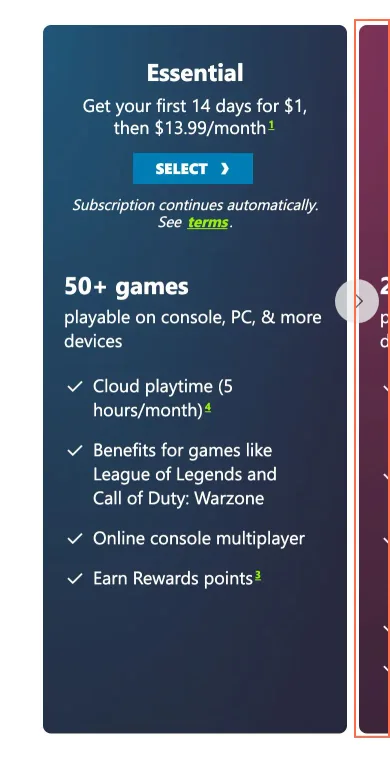
At 820 and 390 px the Game Pass plan carousel sets aria-hidden 'true' on 3 cards (ids 'standard', 'ultimate' and 'pc'), and each keeps a footnote link, '1, jump down to the legal section', in the Tab order. axe reports aria-hidden-focus on all 3. At 390 px, Tabs 37, 38 and 39 land on those links.
Implication
Keyboard focus reaches a link inside a plan card a screen reader has been told to ignore, on the page where a visitor compares Game Pass plans, so the link is announced with no plan around it.
Recommendation
Remove aria-hidden from the cards, or set inert on the off-screen cards so their links leave the Tab order until the card is shown.
Measured
- Tabs 37 to 39 land inside aria-hidden cards
- axe aria-hidden-focus: 3 elements (serious)
Finding 13Low
The Project Perception image doesn't load at 820 px on Microsoft Security
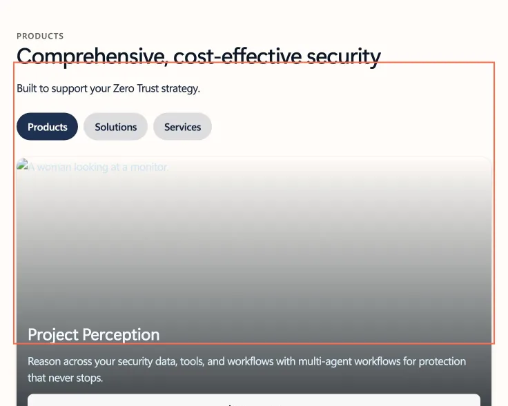
Observation
At 820 × 1180 the Project Perception card's image has the address 'https://www.microsoft.com/en-ca/0.65,15,0&wid=2000…', which loads nothing, so the card shows its alt text over an empty panel. At 1440 px the same image loads from the Dynamic Media host at 1659 px. axe's color-contrast result on this card's heading comes from the missing image.
Implication
A tablet visitor sees an empty panel with a broken-image mark in the first product card on the page.
Recommendation
Fix the image's source for this width. The address holds only the part after a comma in the Dynamic Media parameters, so escape the commas as %2C in the srcset entry.
Measured
- Project Perception image: naturalWidth 0 at 820 px
- axe color-contrast: 1 element (serious)
What was examined
- Home
- Microsoft 365
- Compare Microsoft 365 plans
- Microsoft 365 for business
- OneNote app
- Microsoft Teams
- Windows
- Help me choose a PC
- Apps for Windows
- Surface
- Surface Laptop Ultra
- Surface accessories
- Surface support centre
- Store: shop all Surface
- Store: deals
- Store: Xbox controllers
- Store product: Surface Laptop Ultra for Business
- Store product: Xbox Series X
- Store: configure Surface Laptop
- Returns
- Order tracking
- Xbox Game Pass
- Azure
- Microsoft AI
- Microsoft Security
- Microsoft in education
- Microsoft products and apps
- Download Center
- Sign in
- Support
- Contact Microsoft
- Accessibility
- Privacy
- Choose your language
- Accueil (French home)
- Surface (French product)
I didn’t observe real users. I examined only public pages, signed out, on the date shown and at the sizes listed. A browser took the measurements, and each finding gives its numbers.
Automated checks
| Accessibility rules failed (axe) | 7 rules: 1 critical, 6 serious |
|---|---|
| Tap targets under 24 pixels | 24 |
| Links that open a new tab | 411 |
| Console errors on load | 53 |
The 7 rules, by impact, with the elements and pages each failed on
button-namecriticalWCAG 4.1.2 Name, Role, Value (A) · 1 element on 1 page: Xbox Game Pass
button-name: not counted against the level, because The one element is the Game Pass page’s Xbox menu button at 820 and 390 px. The saved accessibility tree names it “XBOX ” (captures/pages/game-pass/tablet/aria.yml and mobile/aria.yml), so it has a name; the image inside it is not what names it.
label-content-name-mismatchseriousWCAG 2.5.3 Label in Name (A) · 121 elements on 26 pages: Home; Microsoft 365; Microsoft 365 for business; OneNote app; Microsoft Teams; Apps for Windows; Surface; Surface Laptop Ultra; Surface accessories; Surface support centre; Store: shop all Surface; Store: deals; Store: Xbox controllers; Store product: Surface Laptop Ultra for Business; Store product: Xbox Series X; Store: configure Surface Laptop; Returns; Microsoft AI; Microsoft Security; Microsoft in education; Microsoft products and apps; Support; Contact Microsoft; Accessibility; Accueil (French home); Surface (French product)
target-sizeseriousWCAG 2.5.8 Target Size (Minimum) (AA) · 7 elements on 2 pages: Surface accessories; Sign in
aria-hidden-focusseriousWCAG 4.1.2 Name, Role, Value (A) · 3 elements on 1 page: Xbox Game Pass
color-contrastseriousWCAG 1.4.3 Contrast (Minimum) (AA) · 3 elements on 2 pages: Store: deals; Microsoft Security
color-contrast: not counted against the level, because 3 elements. The 2 original prices on the Microsoft Store deals page (12 px #889399 on #FEFEFE, 3.11:1) are published in f5, a low finding because deals isn’t a primary page. The third is the Project Perception card’s h3 on the security page at 820 px, whose white text is drawn over the image that doesn’t load; f10 gives the cause.
link-nameseriousWCAG 2.4.4 Link Purpose (In Context) (A); WCAG 4.1.2 Name, Role, Value (A) · 1 element on 1 page: Surface Laptop Ultra
scrollable-region-focusableseriousWCAG 2.1.1 Keyboard (A); WCAG 2.1.3 Keyboard (No Exception) (AAA) · 1 element on 1 page: Contact Microsoft
The engine counted these on every page I examined, at all three sizes.