UX heuristic analysis · Telecom and health
UHC.com: a UX heuristic analysis
For UnitedHealthcare’s digital product team
- Assessed
- Published
- Examined
- 10 pages of uhc.com at desktop (1440 px), tablet (820 px) and phone (390 px)
- Method
- 10 public pages of uhc.com, read signed out at three sizes (1440 × 900, 820 × 1180, 390 × 844) in headful Google Chrome on 2026-10-25, because the site's bot protection refuses a plain read; the page addresses were found by web search for the same reason, and robots.txt answered 403, so no sitemap was read. Measured with axe-core and the engine's own checks, through the engine's own resolver. The explorer sends no writes, so survey, chat and analytics calls were refused; the empty feedback frame in some full-page pictures is that refusal, and console errors from refused or failed resources are not counted; reviewed from Toronto, Canada
Summary
uhc.com's plan finder and plan links say the wrong thing: an empty ZIP label and a link named for another plan
The Medicare plan finder's ZIP field has an empty label and fills itself from location: from Toronto it held 'M6H', a value its 5-digit pattern cannot accept. Its search has invalid ARIA and a Search button with no visible focus, and on phones a call bar covers it. On Shop for a plan, 'Mental health virtual therapy' is named 'View accident insurance'. Seen from Toronto, Canada.
Where to start
- Finding 5: The Medicare ZIP field has an empty label and pre-fills a value it cannot accept Medium
- Finding 3: On Shop for a plan, 'Mental health virtual therapy' is named 'View accident insurance' Medium
- Finding 7: On phones the Medicare call bar nests a phone link inside a button and covers the search Medium
- Finding 6: The Medicare page's 'How can we help you?' search has invalid ARIA and an unseen focus Medium
| High | Medium | Low | Best practice |
|---|---|---|---|
| 0 | 5 | 1 | 2 |
The 8 findings
Findings about the whole site first, then each page in the order examined, the most severe first within each. The levels, high, medium, low, best practice, are explained on the method page.
Finding 1Low
Seven pages are 1446 px wide at 1440 px and move 6 px sideways
Observation
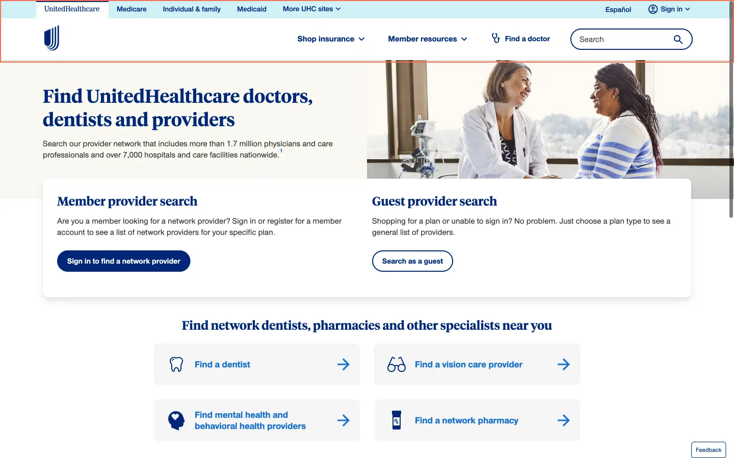
At 1440 px Find a doctor, Member sign-in, Pharmacy benefits, Claims, Contact us, Member forms and the accessibility statement are 1446 px wide, so they scroll 6 px sideways. The global header’s navigation (abyss-parcel) reaches 1446 px. Home, Shop for a plan and Medicare are 1440 px wide. Captures on 25 and 27 October measured the same.
Implication
A visitor who scrolls with a trackpad, or a mouse that scrolls sideways, moves the whole page 6 px to the side on every one of these pages.
Recommendation
Size the header’s navigation to the page (width: 100% in place of 100vw, or no extra margin), and check the seven page templates at 1440 px with a classic scrollbar shown and hidden.
Measured
- Find a doctor and 6 other pages: 1446 px wide in a 1440 px viewport
- Home, Shop and Medicare: 1440 px wide
- Same on 25 and 27 October (fresh profile)
Finding 2Best practice
Most links tried on Shop and Medicare do not change when the pointer is on them
Observation
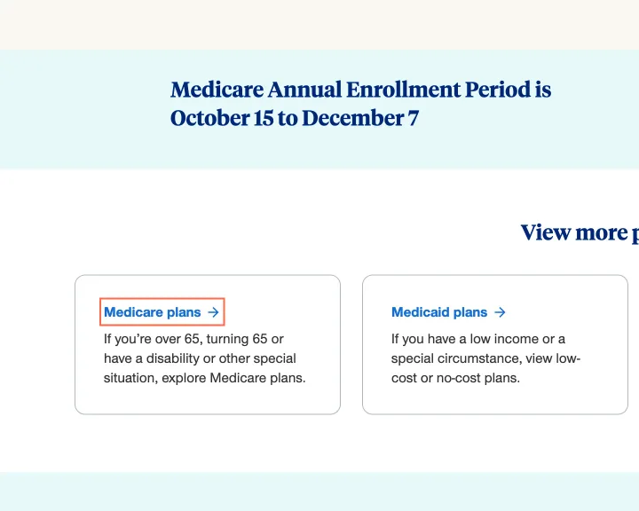
At 1440 px, 8 of 9 links tried on Shop for a plan ('Medicare plans', 'Medicaid plans', 'Individual and family plans' among them), 6 of 8 on Medicare and 4 of 10 on Pharmacy benefits look the same with the pointer on them: no change of colour, background, underline, border, opacity or shadow.
Implication
People using a mouse get no sign that a card title or link is live before they click, and on pages full of blue headings and blue links they cannot tell which is which until they try.
Recommendation
Underline links on hover and focus, or darken them, on every page; the same rule in the shared link style covers the card titles on Shop for a plan and the plan links on Medicare.
Measured
- No hover state: 8 of 9 links tried
- No hover state: 6 of 8 links tried
- No hover state: 4 of 10 links tried
Finding 3Medium
On Shop for a plan, 'Mental health virtual therapy' is named 'View accident insurance'
Observation
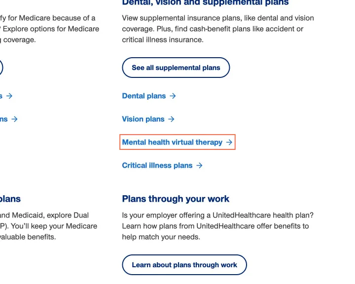
On Shop for a plan at 1440 and 820 px the link 'Mental health virtual therapy', to the mind-your-health page, has aria-label 'View accident insurance', the name of the Accident insurance link. axe label-content-name-mismatch (serious, WCAG 2.5.3) fails on it. On Find a doctor at 390 px 'Open the app' is named 'Open the UHC app to find a provider'.
Implication
A screen reader user hears 'View accident insurance' twice and cannot reach mental health therapy by name, or opens therapy expecting accident cover. A voice control user who says 'click Mental health virtual therapy' or 'click Open the app' gets no match: neither name holds the words on screen.
Recommendation
Remove the aria-label from both links and let the visible text name them, or start each name with its visible words ('Mental health virtual therapy plans'). Check every card link on the page against its destination when copy changes; this one shares a name with the link after it.
Measured
- 'Mental health virtual therapy' named 'View accident insurance'
- axe label-content-name-mismatch: 1 element (serious)
Finding 4Medium
On Shop for a plan the header’s ‘Español’ link is 20 px tall, with a target within 12 px
Observation
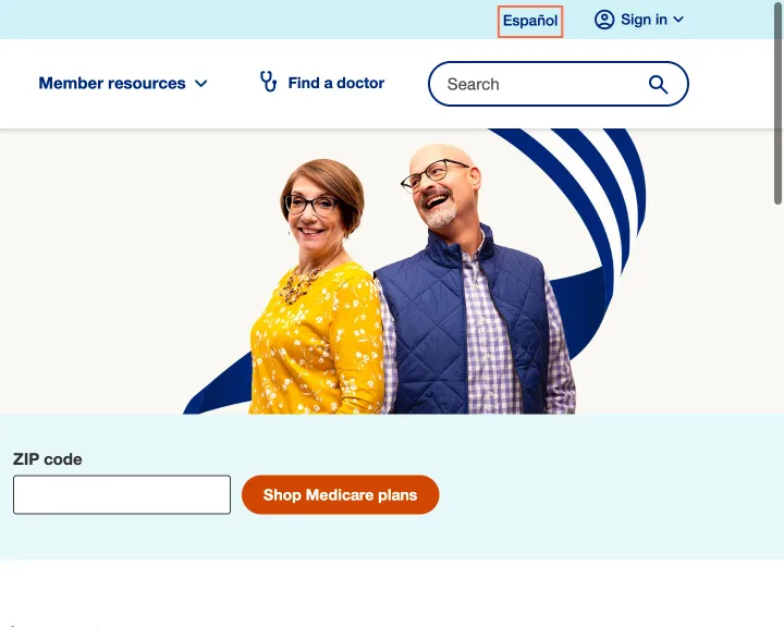
At 1440 px the header link ‘Español’, the way to the Spanish-language site, is 50.4 × 20 px on Shop for a plan, under the 24 × 24 px minimum, with another target within 12 px of its centre. The capture of 25 October found the same on Home. On Medicare the same link is 24 px tall.
Implication
Someone with a tremor or limited pointer control can miss the one link to the site in their language, or open the target beside it instead.
Recommendation
Give the link 2 px of padding above and below so it is at least 24 px tall, in the header template so every page gets it, or keep 12 px clear around its centre.
Measured
- 27 October, fresh profile: Shop ‘Español’ 50.4 × 20 px, target within 12 px
- 25 October: Home ‘Español’ 50.4 × 20 px, target within 12 px
- Medicare ‘Español’: 24 px tall
Finding 5Medium
The Medicare ZIP field has an empty label and pre-fills a value it cannot accept
Observation
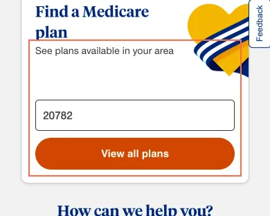
The 'Find a Medicare plan' field has a label element, but it is empty, so the field's only name is the placeholder 'Enter ZIP code', at all three sizes. It fills itself from a location cookie: on 26 October, from Toronto, it held 'M6H', a Canadian postal prefix its 5-digit numeric pattern cannot accept; in the 25 October capture it held '20782', and the placeholder was gone.
Implication
Once the field is filled, the screen shows a bare value with no label. A visitor can press View all plans for an area that is not theirs; Medicare plans differ by county, so the prices and doctors shown can be wrong.
Recommendation
Put 'ZIP code' in the empty label, as the home page's hero does. If a ZIP code is filled in from location, say so beside it ('Showing plans for 20782. Change'), and fill only a value the field accepts.
Measured
- 25 Oct: ZIP field label empty; it arrived holding 20782
- 26 Oct: empty label; field pre-filled 'M6H' from a location cookie
Finding 6Medium
The Medicare page's 'How can we help you?' search has invalid ARIA and an unseen focus
Observation
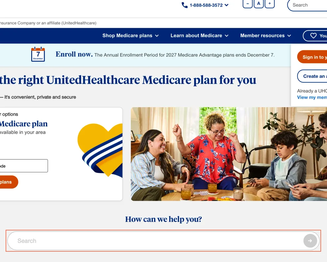
On the Medicare page's 'How can we help you?' search, the text field has aria-expanded but no role, so it is a textbox, which does not allow it; the div around it has aria-expanded too. axe aria-allowed-attr (critical, WCAG 4.1.2) fails at all three sizes. The Search button shows no change when focused, at 820 and 390 px in the capture and at 1440 and 500 px on 26 October.
Implication
Screen readers may announce the field as collapsed or ignore the suggestions list, so a listener cannot tell that suggestions exist. A keyboard user on a tablet loses sight of focus when it reaches Search and cannot tell whether Enter will search.
Recommendation
Build the field as a combobox: role='combobox' on the input with aria-expanded and aria-controls there, and remove aria-expanded from the wrapping div. Give the Search button a 2 px focus outline with 3:1 contrast against the page, as the header's search has.
Measured
- axe aria-allowed-attr: 2 elements (critical)
- 26 Oct: textbox with aria-expanded; Search button shows no focus
- Tab stop 14, Search: no focus indicator
Finding 7Medium
On phones the Medicare call bar nests a phone link inside a button and covers the search
Observation
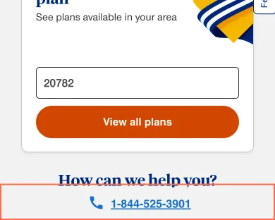
On phones the fixed 'get help' bar at the foot of the Medicare page is a button wrapping a tel: link, both in the Tab order and both named with the phone number. axe nested-interactive (serious, WCAG 4.1.2) fails on it. At 500 × 667 px on 26 October the 46.5 px bar covered 41.7 px of the 'How can we help you?' field and 33.7 px of its Search button.
Implication
A screen reader user meets two controls with one name, one inside the other, and cannot tell which places the call. Calling is how many people choose a Medicare plan. While the bar covers the search, a tap meant for Search can start a call instead.
Recommendation
Make the bar one tel: link, named 'Call' with the number and TTY 711, with no button around it. Add bottom padding to the page equal to the bar's height, so the bar never covers the search or any other control.
Measured
- Call bar: a button wrapping a tel: link, over the search
- axe nested-interactive: 1 element (serious)
- 26 Oct at 500 px: bar covers 41.7 px of the field and 33.7 px of Search
Finding 8Best practice
The sign-in page's Broker E-Store link has a testing tool's preview token
Observation
On the sign-in page the 'Sign in to Broker E-Store' link goes to uhone.com with 'at_preview_token=…', 'at_preview_index=1_1' and 'at_preview_listed_activities_only=true' in its address at all three sizes. These are Adobe Target's preview parameters, used to see a test variant before launch. The page's other sign-in links have clean addresses.
Implication
No harm was measured, since the broker site was not opened. But every broker who signs in from here may be shown a preview of a test, or skew that test's numbers, and the token, meant for staff, is published on a public page.
Recommendation
Replace the link with the plain sign-in address, https://www.uhone.com/broker/main/default.aspx?portalsignin=broker-individual-signin, and check the CMS for other links copied from a preview session (search the site's links for 'at_preview').
Measured
- Broker sign-in link has an Adobe Target preview token
What was examined
- Home
- Shop for a plan
- Medicare
- Find a doctor
- Member sign-in
- Pharmacy benefits
- Claims: how to submit a claim
- Contact us
- Member forms
- Accessibility statement
No real users were observed. Only public pages were examined, signed out, on the date shown, at the sizes listed. A browser took the measurements; the numbers are in each finding.
Automated checks
| Accessibility rules failed (axe) | 3 rules: 1 critical, 2 serious |
|---|---|
| Tap targets under 24 pixels | 3 |
| Links that open a new tab | 0 |
| Console errors on load | 2 |
The 3 rules, by impact, with the elements and pages each failed on
aria-allowed-attrcriticalWCAG 4.1.2 Name, Role, Value (A) · 2 elements on 1 page: Medicare
label-content-name-mismatchseriousWCAG 2.5.3 Label in Name (A) · 6 elements on 6 pages: Home; Shop for a plan; Find a doctor; Claims: how to submit a claim; Member forms; Accessibility statement
nested-interactiveseriousWCAG 4.1.2 Name, Role, Value (A) · 1 element on 1 page: Medicare
Counted by the engine on every page examined, at all three sizes, in headful Chrome. Console errors from refused or failed resources are not counted.