UX heuristic analysis · Banks and insurers
CIBC.com: a UX heuristic analysis
For CIBC’s digital product team
- Assessed
- Published
- Examined
- 43 pages of CIBC at desktop (1440 px), tablet (820 px) and phone (390 px)
- Method
- 43 public pages, read signed out at three sizes (1440 × 900, 820 × 1180, 390 × 844) in Chrome on 30 October 2026, a card detail page, a French product page, a branch page and the results for 'chequing' among them; measured with axe-core and the engine's own checks, every finding checked by hand. I reviewed the pages from Toronto, Canada.
Last checked . The site may have changed since. This page shows what I saw on that day.
Summary
CIBC's branch locator names its search box 'home.search.ariaLabel'
On CIBC.com's branch locator the search box is named 'home.search.ariaLabel', a code key, and the phone menu button has no name at all. All Cards has 11 links named only 'Opens a new window', the home page has 8 icon links with no name, and the play button on Accessibility at CIBC has none either. On GIC rates, 13 accordion buttons each hold a footnote link between 7.9 and 17.3 px wide. axe found 10 rules failing across 43 pages at 3 sizes, which I read from Toronto, Canada, in Chrome, because CIBC.com refused headless Chromium.
Where to start
- Finding 11: The branch locator's search box is named 'home.search.ariaLabel' Medium
- Finding 3: 11 links on the All Cards page are named only 'Opens a new window' Medium
- Finding 2: The 8 icon links on the home page have no name Medium
- Finding 13: The play button on the Accessibility at CIBC page has no name Medium
- Finding 7: 13 accordion buttons on the GIC rates page hold a footnote link Medium
| High | Medium | Low | Best practice |
|---|---|---|---|
| 0 | 8 | 7 | 1 |
The 16 findings
The findings about the whole site come first, then each page in the order I examined it, most severe first within each. The levels (high, medium, low, best practice) are explained on the method page.
Finding 1Best practice
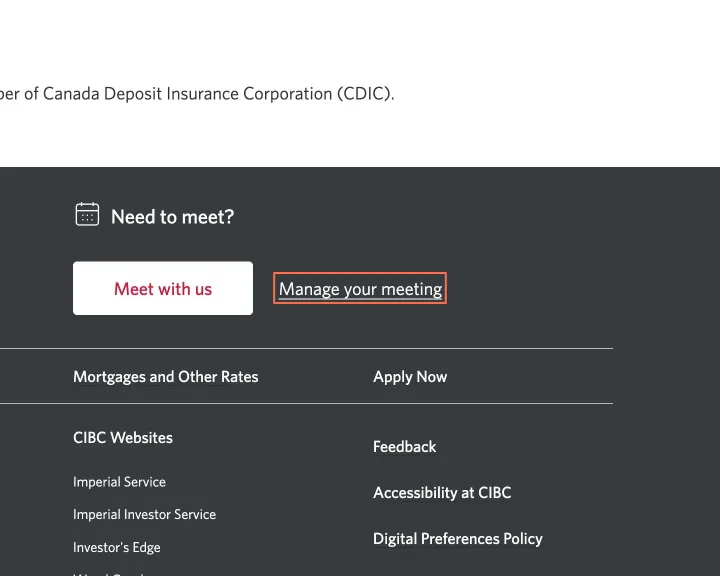
The footer's 'Manage your meeting' link opens a new tab with no cue
Observation
On 36 of the 43 pages the footer link 'Manage your meeting' opens a new tab with no icon and nothing in its name. 'Meet with us', beside it, ends in 'Opens in a new window.', and the 'Manage your meeting' link in the body of Contact Us reads 'Manage your meeting Opens a new window.'
Implication
A screen reader or phone user finds that Back no longer returns to the CIBC page they were reading.
Recommendation
Add the same 'Opens in a new window.' text to the footer link.
Measured
- Manage your meeting: opens a new tab, no cue
Finding 2Medium
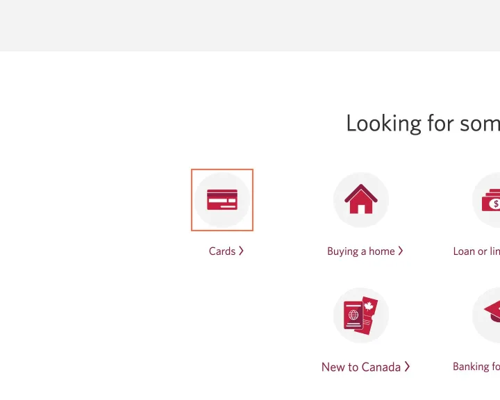
The 8 icon links on the home page have no name
Observation
Each of the 8 home page tiles from 'Cards' to 'US cross-border banking' has an 80 × 80 px icon link with an empty alt, beside a text link to the same address. axe reports link-name on 6 of the 43 pages: 8 elements on the home page, 8 on the French home page, 6 on French special offers, an empty link on Savings accounts, and the logo link on both Search Results pages at 1440 px.
Implication
A keyboard user tabs through 8 extra stops, and a screen reader announces each one as a link with no name or reads its address. On Search Results the link back to the home page has no name.
Recommendation
Put the icon and the text in one link on each tile. Give the Search Results logo the alt the home page's header logo uses, 'CIBC Personal Banking home.', and remove the empty link on Savings accounts.
Measured
- 8 icon links: alt empty, no name
- axe link-name, home: 8 elements (serious)
- axe link-name, savings: 1 element (serious)
- axe link-name, fr-home: 8 elements (serious)
Finding 3Medium
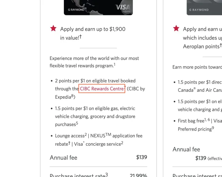
11 links on the All Cards page are named only 'Opens a new window'
Observation
On All Cards, 11 visible links carry the aria-label ' Opens a new window.', which replaces their text: 'CIBC Rewards Centre' 8 times, 'Costco.ca' twice and 'Costcobusinesscentre.ca' once. axe reports label-content-name-mismatch on 11 elements at all 3 sizes.
Implication
A screen reader says 'Opens a new window' and doesn't say what opens, and its links list shows the same words 11 times. A voice-control user who says 'CIBC Rewards Centre' doesn't reach the link.
Recommendation
Add the visible text to the start of each aria-label, or remove the label and put the new-window text in a visually hidden span, as the footer's links do.
Measured
- axe label-content-name-mismatch: 11 elements (serious)
Finding 4Low
The picker on Compare Credit Cards has 6 empty headings
Observation
The card picker on Compare Credit Cards opens each of its 6 groups with an h2 that has no text, at 1440 and 390 px. The class is chooseCardsCategoryTitle, and the text is absent from the page.
Implication
A screen reader's heading list shows 6 blank entries, and nothing tells a visitor what each group of cards has in common.
Recommendation
Fill each h2 with its category name, or remove the element where a group has no name.
Measured
- 6 empty h2 elements in the card picker
Finding 5Low
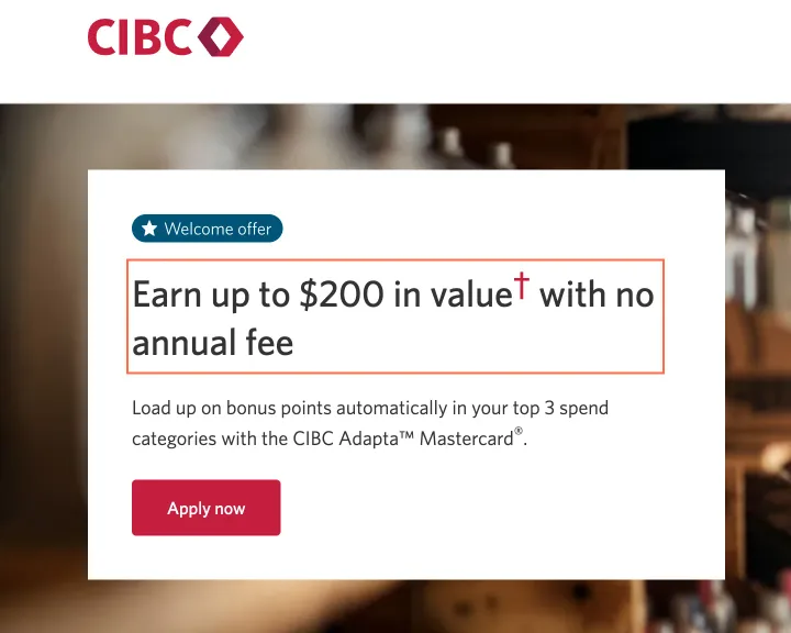
The Adapta Mastercard offer page has no h1
Observation
On the Adapta Mastercard offer page the main line, 'Earn up to $200 in value', isn't a heading, and the first heading is the h2 'Here's how it adds up:'. The other 42 pages I read each have an h1.
Implication
A screen reader user who jumps to the first heading lands below the offer and the 'Apply now' button.
Recommendation
Mark 'Earn up to $200 in value' as the page's h1 in the offer template.
Measured
- No h1; first heading is an h2
Finding 6Medium
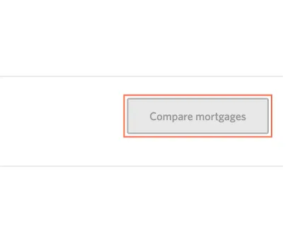
The 'Compare mortgages' links are 2.61:1 grey and stay in the Tab order
Observation
At 820 px the 3 'Compare mortgages' links are grey on grey at 2.61:1, and axe reports color-contrast. They carry disabled="disabled" and href="#", which does nothing on a link: each takes a Tab stop, and a click or Enter changes nothing until 2 mortgages are ticked.
Implication
A low-vision visitor struggles to read the label. A screen reader user hears a working link that does nothing, and the page says to choose up to 3 mortgages without saying that 2 are needed.
Recommendation
Raise the label to at least 4.5:1, add aria-disabled="true" until 2 mortgages are ticked, and add the 2 to the line at the top of the page.
Measured
- 3 links stay in the Tab order, do nothing
- axe color-contrast: 3 elements (serious)
Finding 7Medium
13 accordion buttons on the GIC rates page hold a footnote link
Observation
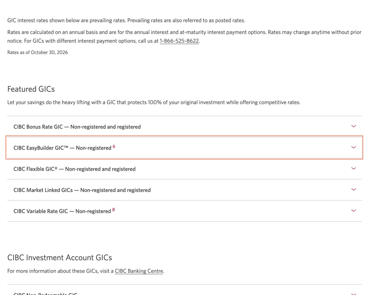
On GIC rates, 13 accordion title buttons each contain a footnote link, such as '6' inside 'CIBC EasyBuilder GIC™ — Non-registered', which is 8.5 × 18.5 px at 1440 px and takes its own Tab stop. The 13 links are between 7.9 and 17.3 px wide. axe reports nested-interactive and target-size on 13 elements at all 3 sizes, and target-size on a dagger link on Savings accounts.
Implication
Screen readers treat what's inside a button as plain text, so the link to the note that qualifies a GIC may not be announced as a link. A tap that misses the link lands on the button around it and toggles the panel.
Recommendation
Move each footnote link out of the button, into the panel or beside the title, and give it a target of at least 24 × 24 px.
Measured
- axe nested-interactive: 13 elements (serious)
- axe target-size, GIC rates: 13 elements (serious)
- Footnote link: 8.5 × 18.5 px, inside the button
- axe target-size, Savings accounts: 1 element (serious)
Finding 8Low
The field on Search Results is named for a status message
Observation
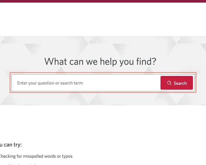
The Search Results field has the aria-label 'For more information, make sure the search field is empty and review the search tips below.' Its placeholder, 'Enter your question or search term', isn't in the name. The name stays the same with 'chequing' in the field and 3,193 results below it.
Implication
A screen reader tells the visitor to keep the field empty, on the page whose task is to fill it in.
Recommendation
Name the field 'Search', or use the placeholder's words, and put the message in a live region of its own.
Measured
- Search field named for a status message
Finding 9Low
On a phone the privacy notice covers Back and part of Continue on sign-on
Observation
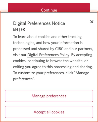
At 390 × 844 the Digital Preferences Notice is 390 × 438 px from y 406, over half of the screen. On the sign-on page it covers the Back button and the bottom 20 px of Continue.
Implication
A phone user has to deal with the notice before finishing sign-on.
Recommendation
Shorten the notice to a short bar at the foot of the screen, under about 200 px, with the policy text behind 'Manage preferences'.
Measured
- Notice: 390 × 438 px of the 844 px screen
Finding 10Low
The Contact Us page shows no phone number until a topic is picked
Observation
Contact Us holds 34 phone links, and none is visible when the page loads. They sit under 'Find the right number to call', behind a 'Show me' list of 7 topics, 'Report fraud' among them.
Implication
A visitor who wants to report fraud or a lost card scrolls past 3 groups of how-to links, then opens a list, to find a number.
Recommendation
Show the main number for each of the 7 topics on the page, with 'Report fraud' first.
Measured
- 34 tel links, 0 visible on load
Finding 11Medium
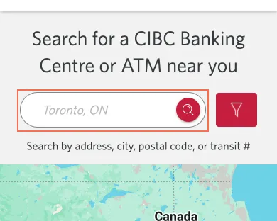
The branch locator's search box is named 'home.search.ariaLabel'
Observation
The branch locator's search box has the aria-label 'home.search.ariaLabel', a code key, at 1440, 820 and 390 px. The header's search box at 1440 and 820 px has 'header.form.search.ariaLabel'. The 'Filter' button is named 'Open search filters', and axe reports label-content-name-mismatch on it at 1440 px and on how-to card links named 'about how to...'.
Implication
A screen reader reads out a code key where it should ask for an address, on the box that starts a branch search. A voice-control user who says 'Filter' doesn't reach the button.
Recommendation
Replace both keys with real text, such as 'Search by address, city, postal code or transit number'. Start the filter button's label with its visible word, 'Filter'.
Measured
- Search box name: home.search.ariaLabel
- axe label-content-name-mismatch: 6 elements (serious)
Finding 12Medium
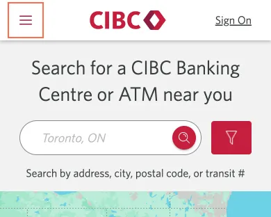
The locator's phone menu button has no name
Observation
At 390 px the 42 × 42 px menu button on the branch locator has no text, label or title, and axe reports button-name (critical) there and on the branch page. It has aria-haspopup='true' and aria-pressed, which goes from 'false' to 'true' when it opens a panel of 9 items, and no aria-expanded.
Implication
A screen reader user on a phone hears a pressed or unpressed button with no name, and isn't told that it opens the menu.
Recommendation
Give the button the aria-label 'Menu', and use aria-expanded in place of aria-pressed, so it reads as a menu that opens and closes.
Measured
- axe button-name, locator and branch page: 1 element each (critical)
- aria-pressed changes; no aria-expanded
Finding 13Medium
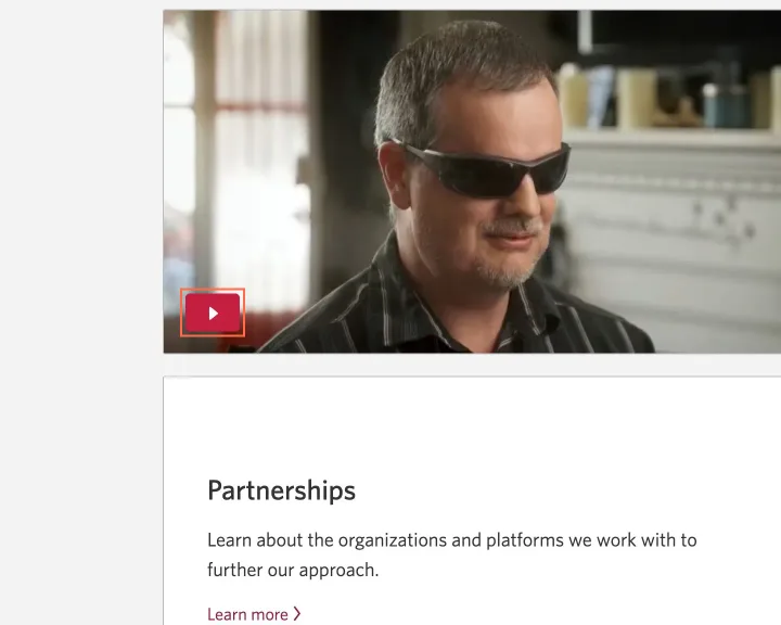
The play button on the Accessibility at CIBC page has no name
Observation
The video on Accessibility at CIBC has a 50 × 35 px play button with no text, label or title, and it takes keyboard focus. Its 569 × 316 px picture has no alt attribute. axe reports button-name and image-alt, both critical, at all 3 sizes.
Implication
A screen reader announces 'button' with nothing about the video, on the page a blind visitor opens to read about CIBC's accessibility.
Recommendation
Give the button an aria-label that names the video, such as 'Play video' followed by its title, and give the picture a description in its alt.
Measured
- axe button-name: 1 element (critical)
- axe image-alt: 1 element (critical)
Finding 14Medium
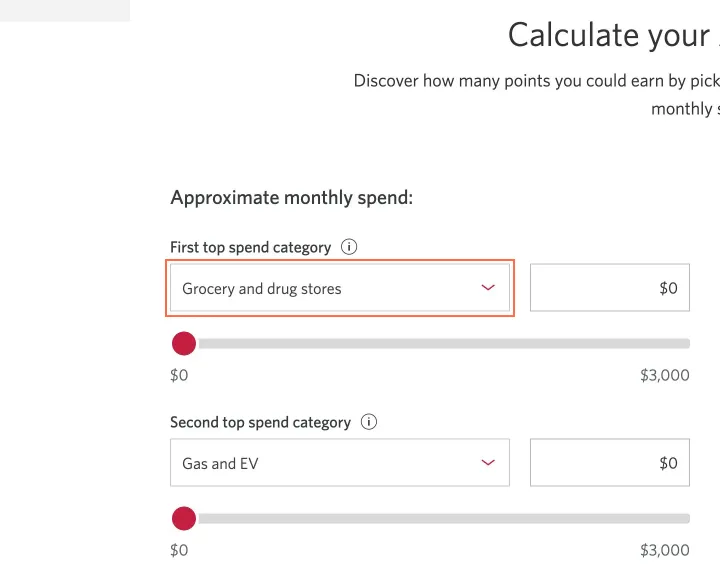
The points calculator's 3 lists and 5 sliders on the Adapta Mastercard page have no name
Observation
On the Adapta Mastercard page the points calculator has 3 category lists with no label, aria-label or title, and 5 sliders with no name. 'First top spend category' labels the amount box beside the first list, and the list itself has nothing. axe reports select-name (critical) on 3 elements and aria-input-field-name on 5 at all 3 sizes.
Implication
A screen reader user hears the selected category and can't tell which of the 3 picks they're changing. Each slider is announced with a value and no name.
Recommendation
Tie each list to the label above it with aria-labelledby, and give each slider an aria-label that names its category.
Measured
- 3 lists and 5 sliders with no name
- axe select-name: 3 elements (critical)
- axe aria-input-field-name: 5 elements (serious)
Finding 15Low
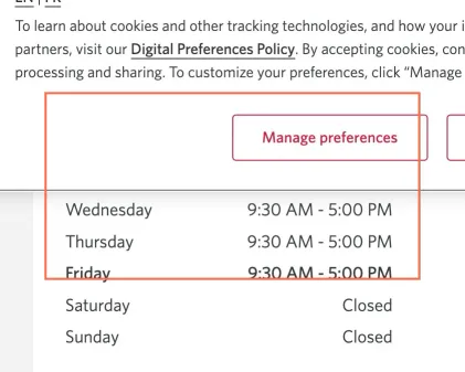
The hours table on the Harwood branch page has code keys for column headers
Observation
On the Harwood Banking Centre page the hours table's column headers are 'details.hours.table.day' and 'details.hours.table.bankingHours', code keys like the one on the locator's search box. They're hidden off-screen, so only assistive technology gets them.
Implication
A screen reader can read a code key beside each day and time, on the table a visitor opens to find out when the branch is open.
Recommendation
Replace the keys with 'Day' and 'Banking hours' in the branch page template.
Measured
- Column headers: details.hours.table.day
Finding 16Low
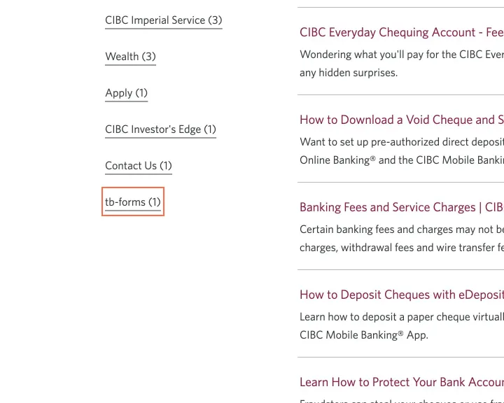
A filter on the Search Results page is labelled 'tb-forms'
Observation
On the results for 'chequing' the last filter reads 'tb-forms (1)', under readable ones such as 'Contact Us (1)'. I read this one query, so other queries' filters aren't checked.
Implication
A visitor can't tell what the filter holds.
Recommendation
Give the category a plain name, such as 'Forms', or leave it out of the filter list.
Measured
- Filter label: 'tb-forms (1)'
What was examined
- Home
- Bank accounts
- Chequing accounts
- Chequing: Smart Plus Account
- Compare bank accounts
- Bank account selector
- Savings accounts
- Credit cards
- All credit cards
- Compare credit cards
- Credit card offer: Adapta Mastercard
- Rewards calculator
- Mortgages
- Compare mortgages
- Mortgage payment calculator
- Mortgage rates
- Bank account rates
- GIC rates
- Lines of credit
- Car loans
- Loan and line of credit calculator
- Insurance
- Travel medical insurance
- Investments
- TFSA
- GIC calculator
- Smart Advice
- How-to: deposit a cheque
- Search results
- Apply
- Apply: loan or line of credit, first step
- Sign on to CIBC Online Banking
- Contact us
- Branch and ATM locator
- ATM and branch network
- Mobile services
- Accessibility at CIBC
- Accueil (French home)
- Offres spéciales (French page)
- Credit card detail: Adapta Mastercard
- Location: Harwood Banking Centre, Ajax
- Search results for 'chequing'
- Compte Intelli CIBC (French product)
I didn’t observe real users. I examined only public pages, signed out, on the date shown and at the sizes listed. A browser took the measurements, and each finding gives its numbers.
Automated checks
| Accessibility rules failed (axe) | 10 rules: 4 critical, 6 serious |
|---|---|
| Tap targets under 24 pixels The engine lists at most 10 per capture. | 124 |
| Links that open a new tab | 108 |
| Console errors on load | 250 |
The 10 rules, by impact, with the elements and pages each failed on
aria-allowed-attrcriticalWCAG 4.1.2 Name, Role, Value (A) · 10 elements on 1 page: Search results for 'chequing'
button-namecriticalWCAG 4.1.2 Name, Role, Value (A) · 3 elements on 3 pages: Branch and ATM locator; Accessibility at CIBC; Location: Harwood Banking Centre, Ajax
image-altcriticalWCAG 1.1.1 Non-text Content (A) · 3 elements on 2 pages: Rewards calculator; Accessibility at CIBC
select-namecriticalWCAG 4.1.2 Name, Role, Value (A) · 3 elements on 1 page: Credit card detail: Adapta Mastercard
link-nameseriousWCAG 2.4.4 Link Purpose (In Context) (A); WCAG 4.1.2 Name, Role, Value (A) · 25 elements on 6 pages: Home; Savings accounts; Search results; Accueil (French home); Offres spéciales (French page); Search results for 'chequing'
label-content-name-mismatchseriousWCAG 2.5.3 Label in Name (A) · 18 elements on 3 pages: All credit cards; Branch and ATM locator; Location: Harwood Banking Centre, Ajax
target-sizeseriousWCAG 2.5.8 Target Size (Minimum) (AA) · 15 elements on 3 pages: Savings accounts; GIC rates; Contact us
nested-interactiveseriousWCAG 4.1.2 Name, Role, Value (A) · 13 elements on 1 page: GIC rates
aria-input-field-nameseriousWCAG 4.1.2 Name, Role, Value (A) · 10 elements on 2 pages: Rewards calculator; Credit card detail: Adapta Mastercard
color-contrastseriousWCAG 1.4.3 Contrast (Minimum) (AA) · 3 elements on 1 page: Compare mortgages
The engine counted these on every page I examined, at all three sizes.
Other Banks and insurers analyses
- Chase.com
Chase.com blurs its CD rates behind a ZIP code prompt that × doesn't close, and on narrow screens its credit card list opens without an APR figure or annual fee amount.
- RBCRoyalBank.com
RBC’s home page names 3 article cards ‘object Object’, and the phone sign-in has a checkbox with no name beside a help button called ‘The svg icon help’.
- Scotiabank.com
Scotiabank.com’s header search box is named ‘trending search results below’, and the Personal Loan Calculator’s 3 inputs have no label.
- TD.com
TD.com’s EasyWeb sign-in page turns off pinch zoom, and a ‘Get started’ button on the chequing page is named ‘Earn 50% more Stars at Starbucks Learn more’.